Home
Work
Contact
About
Home
Work
Contact
About
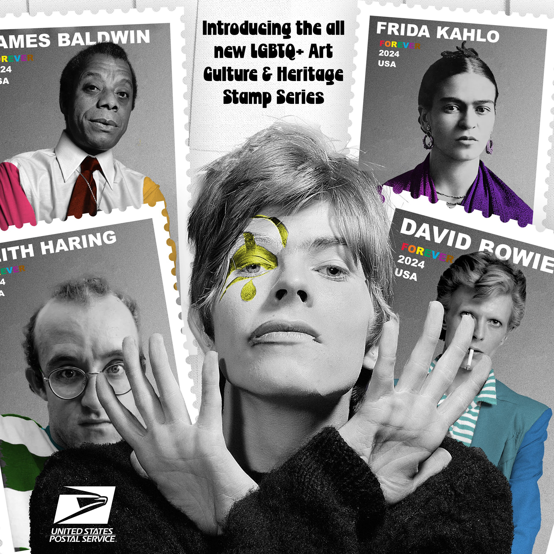
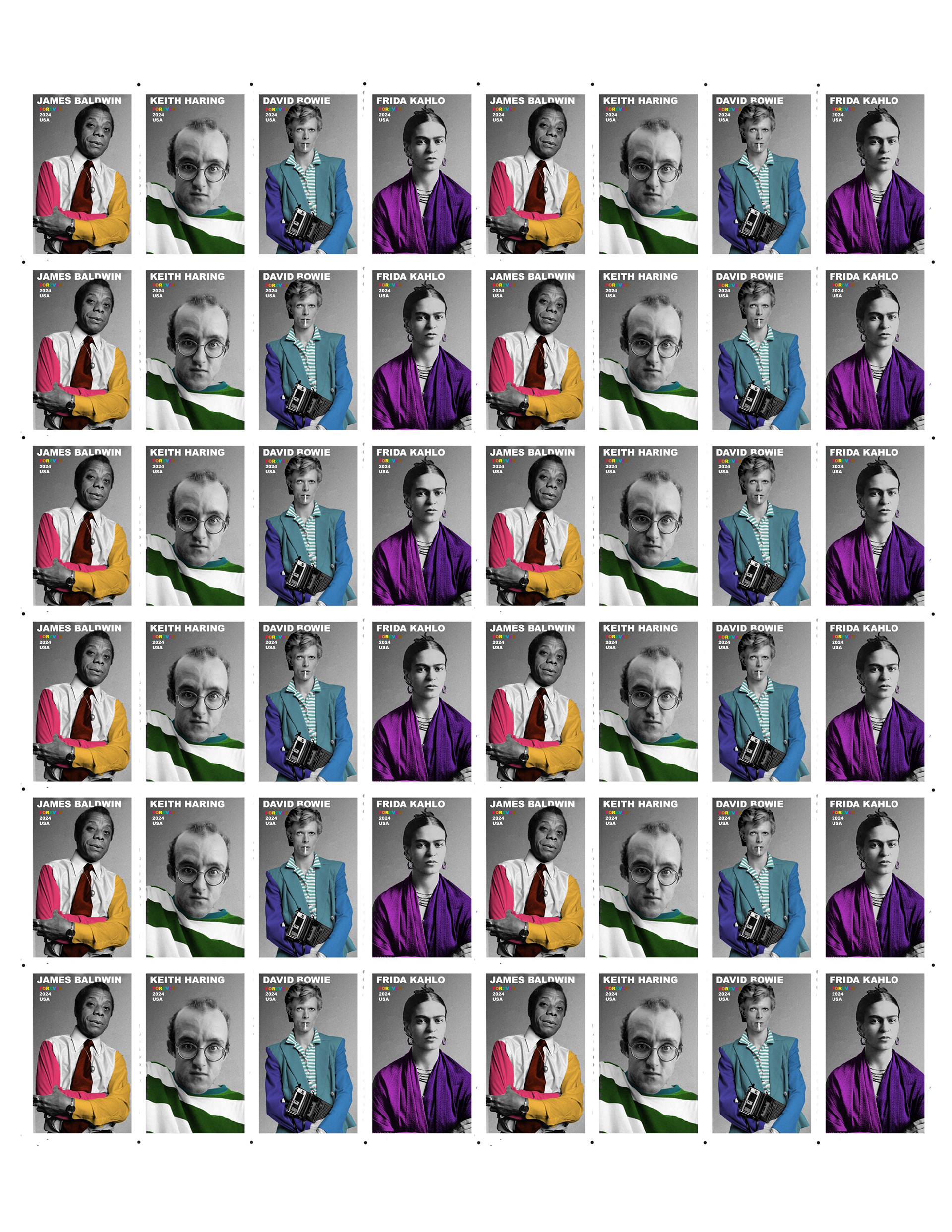
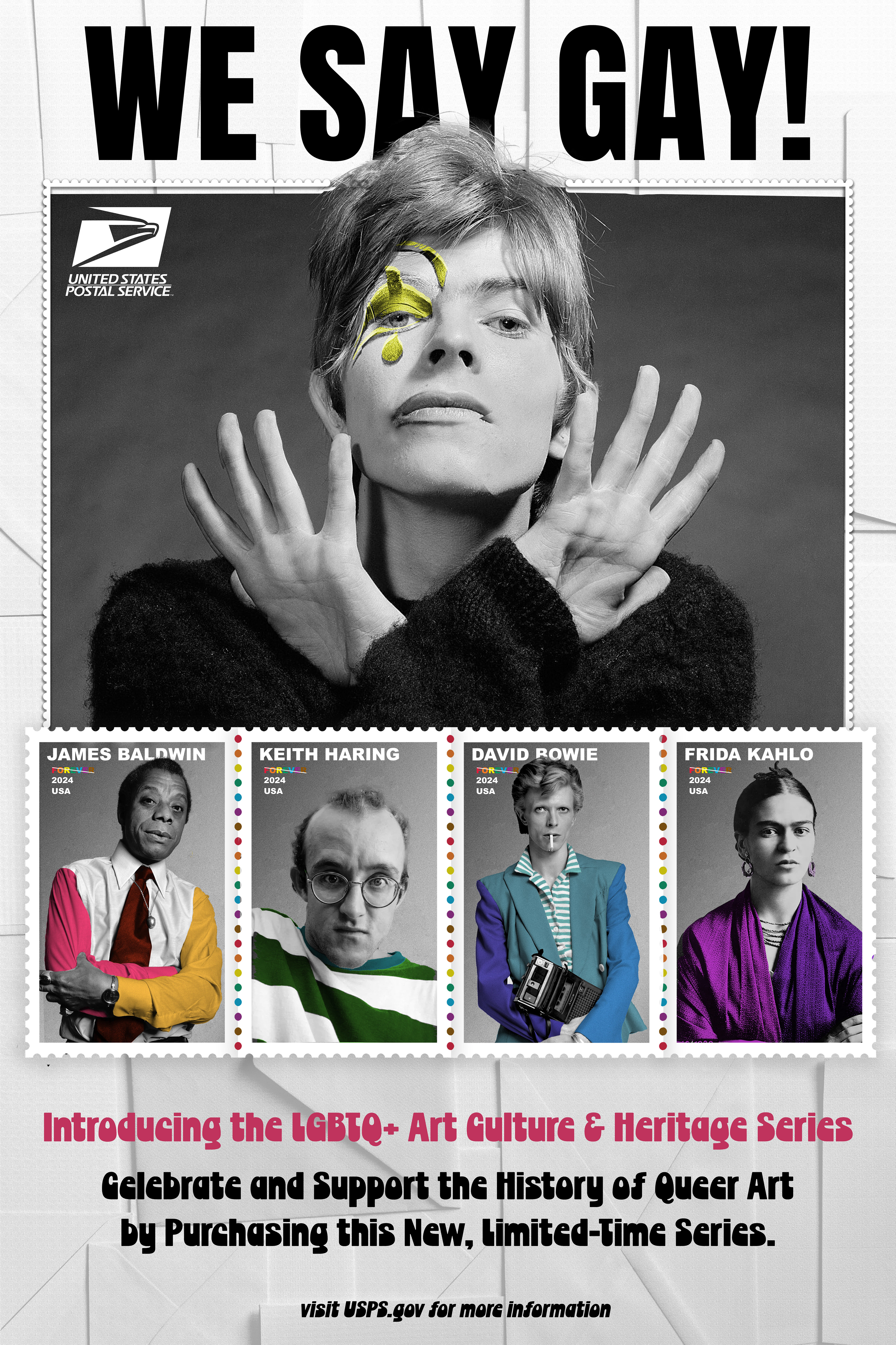
'We Say Gay' Stamps
You may also like
Sophomore Print Portfolio
2025
'Knockout' Type Card Deck
2025
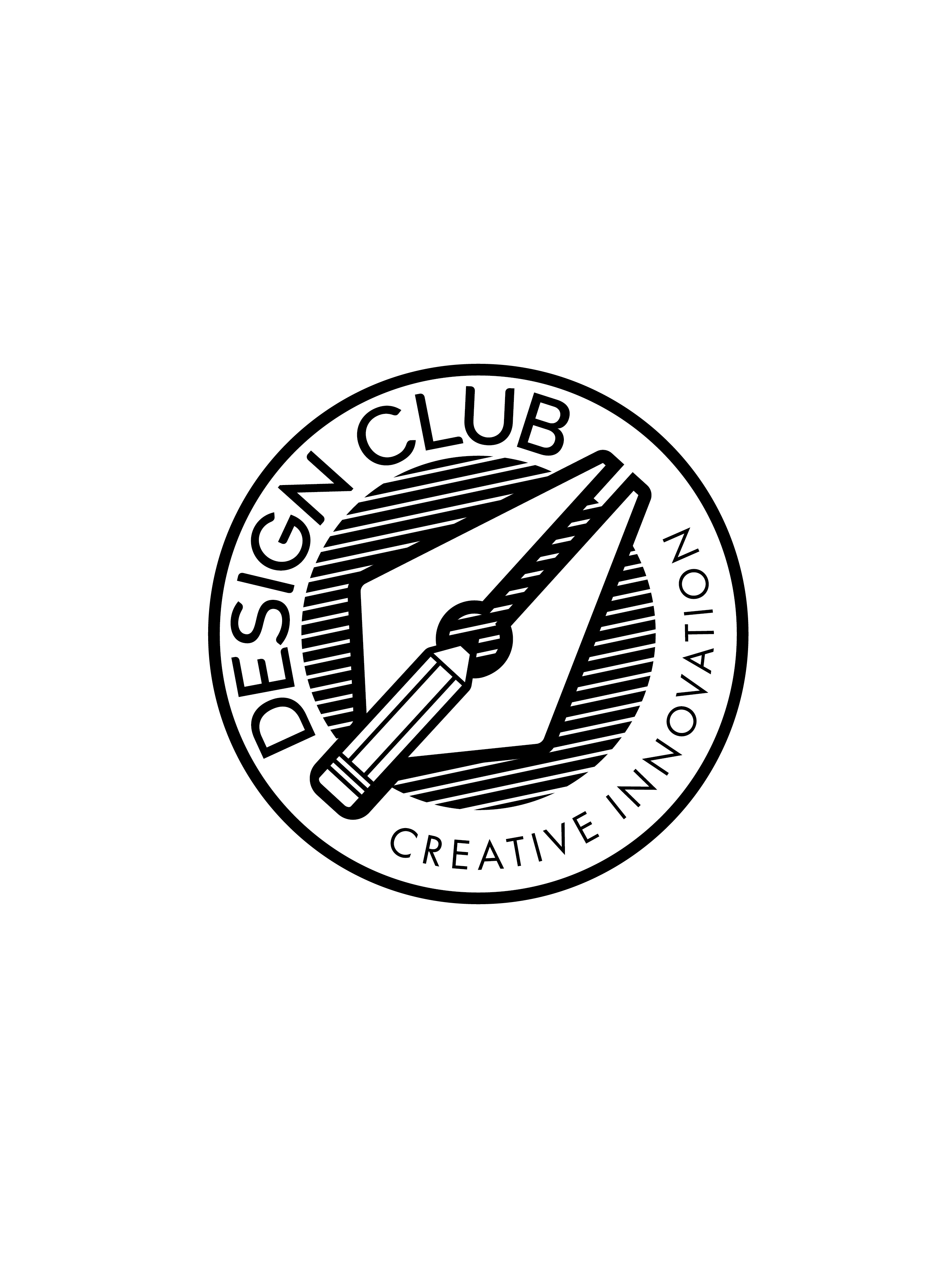
Design Club Advertisements
2025
Magazine Design: Pot-Head
2025
Menu Re-Design: Brickway on Wickenden
2025
Brand Design: Muta
2025
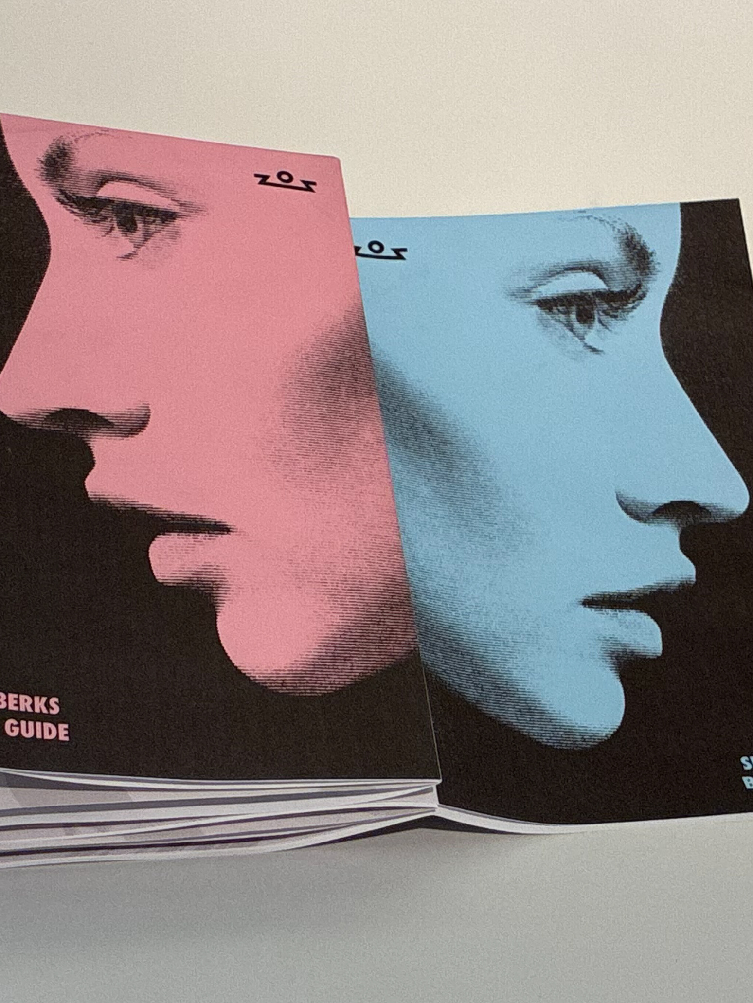
Brand Guideline: Seven Berks
2025
Misc.
2025
Book Cover Design: BLK ART
2025
Colorado Postcard Designs
2025
↑
Back to Top