Home
Work
Contact
About
Home
Work
Contact
About
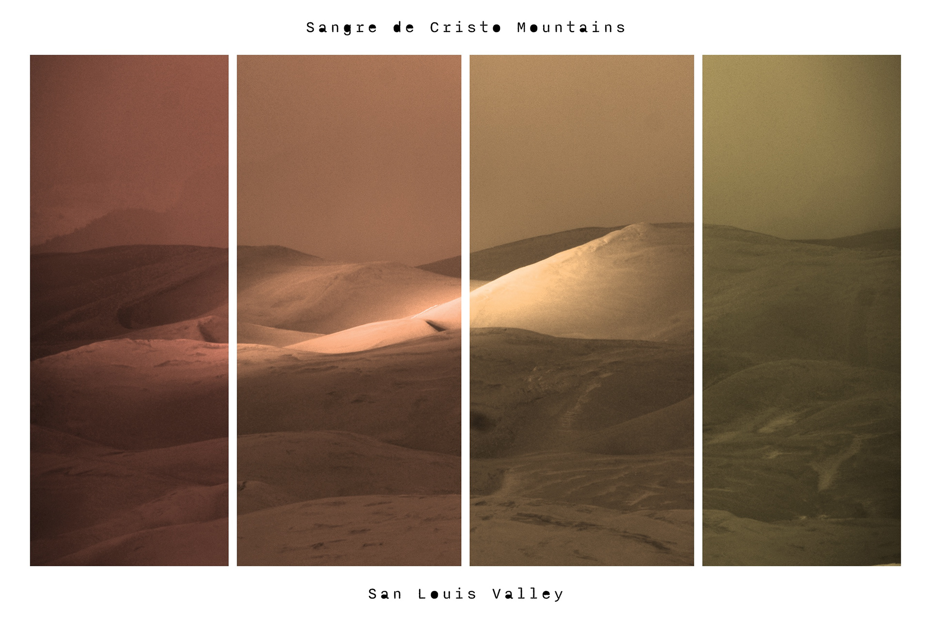
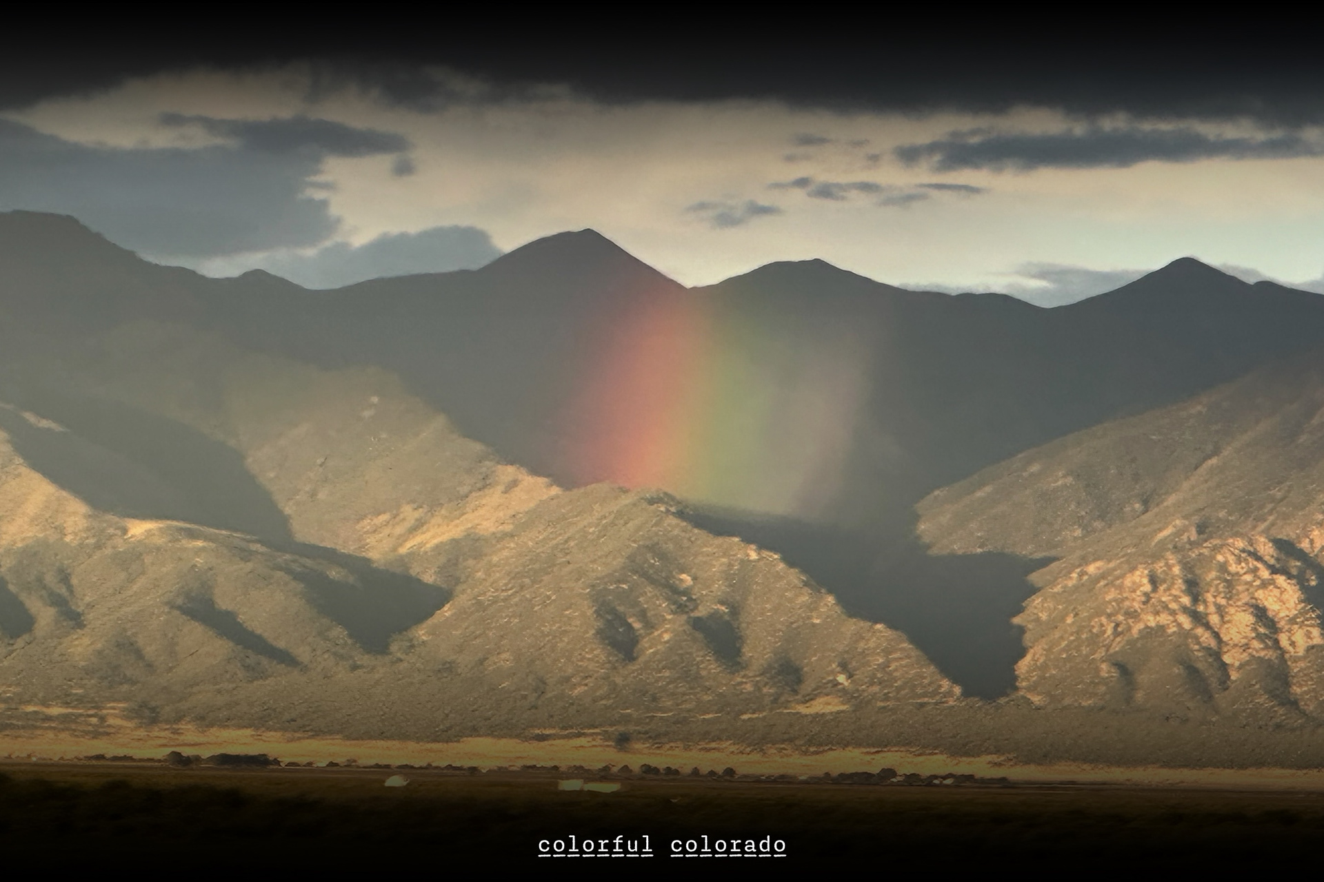
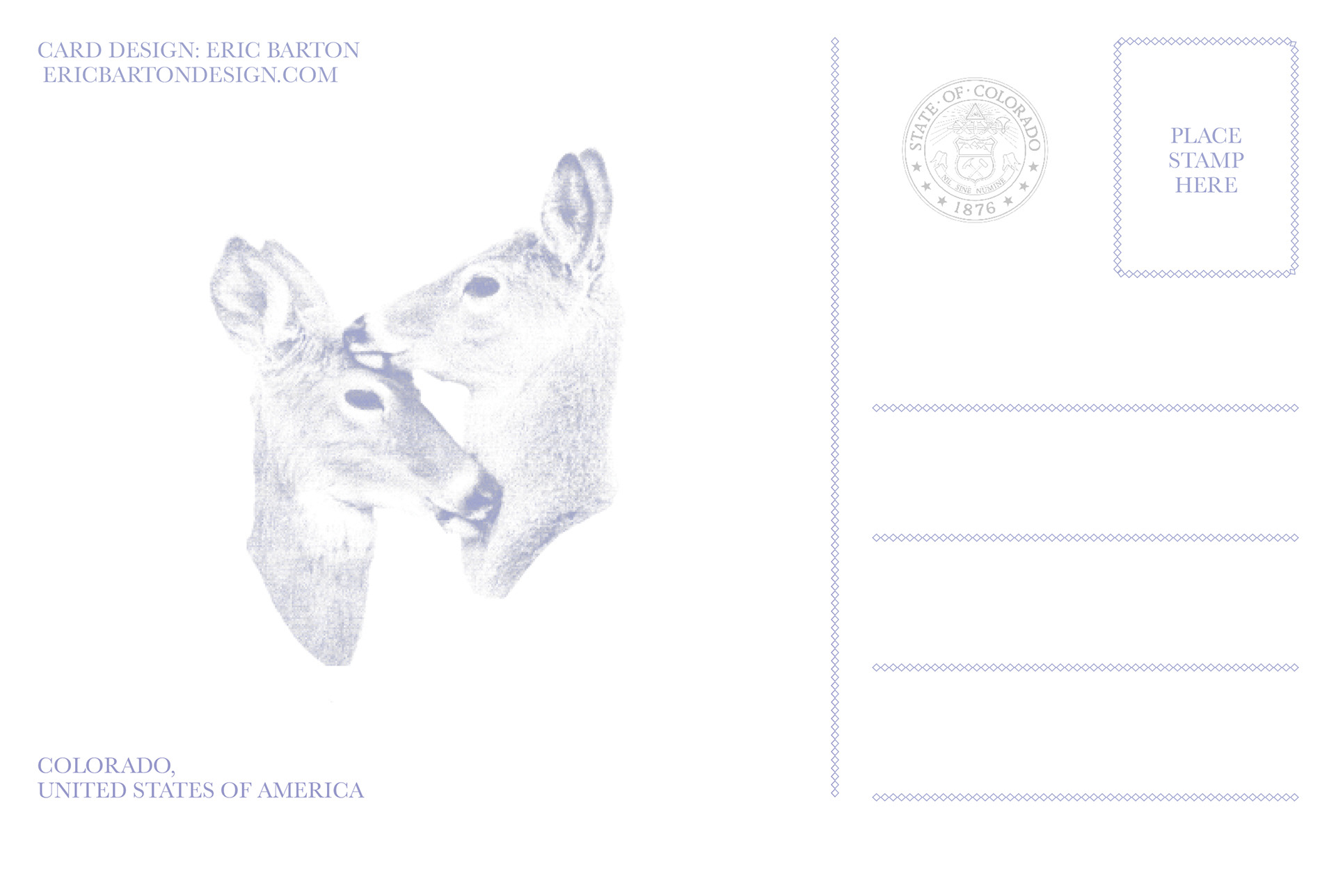
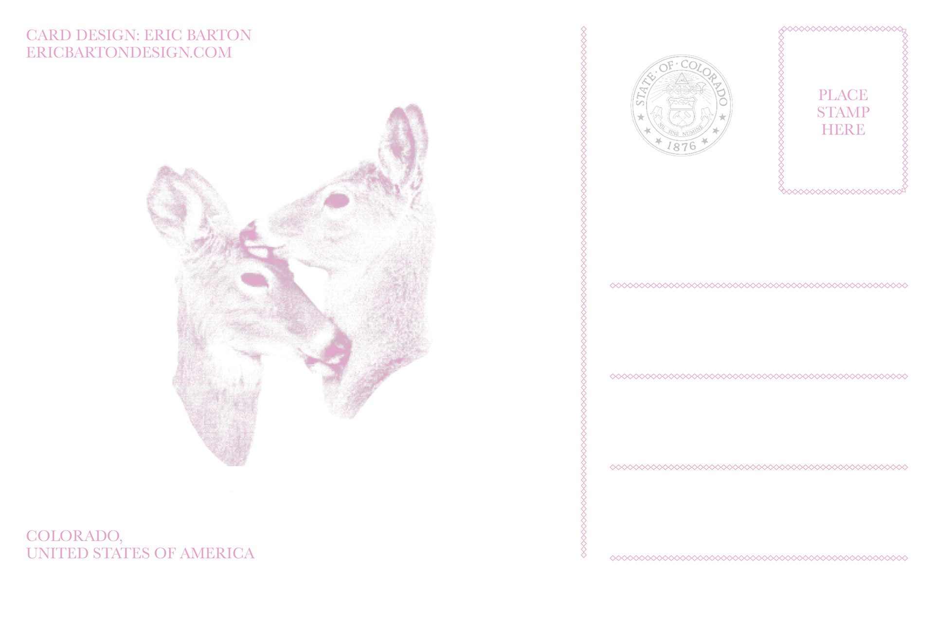
Colorado Postcard Designs
You may also like
Menu Re-Design: Brickway on Wickenden
2025
Sophomore Print Portfolio
2025
'We Say Gay' Stamps
2025
Brand Design: Muta
2025
Magazine Design: Pot-Head
2025
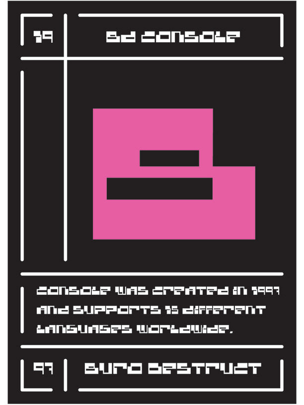
'Knockout' Type Card Deck
2025
Book Cover Design: BLK ART
2025
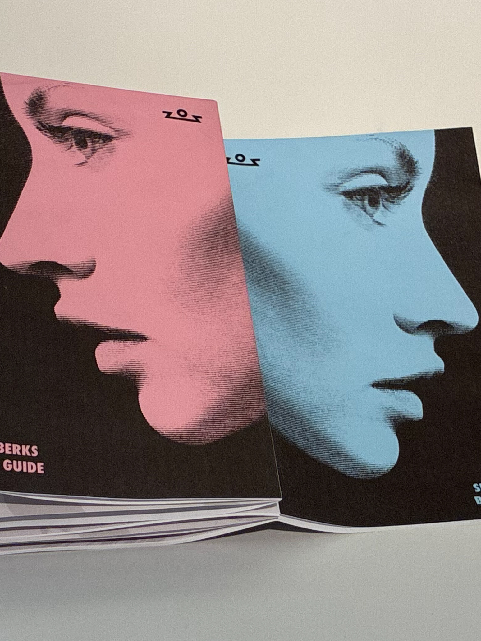
Brand Guideline: Seven Berks
2025
Misc.
2025
Design Club Advertisements
2025
↑
Back to Top